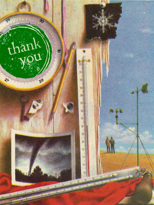
 This week I've been working on notecard sets to deliver to a small gallery in Seattle. One morning at 5:45 am, as one of my cats tried to paw me out of bed, I started thinking about a new card design.
 Thank-you cards always sell fast in my Etsy shop. I make them with pages from old books and a round "thank you" stamp. They're ok, but for a downtown gallery -- shouldn't I add some pizzazz? Bad idea.
Here's how I refined my over-complicated designs into a simple but attractive notecard.
My first idea started with a TV. Specifically, a photo of an old-fashioned TV in a microwave cookbook from the 70s. What if I made it look like the "thank you" was actually on the TV screen? How fun would that be?
 |
| Wood grain is so underrated. |
 |
| Not your mother's cookie. |
I knew where to find illustrations that would match the look of the stamp -- in the old Golden Book Encyclopedias I'd just gotten. The pages were filled with lots and lots of round things.

Hmm, kind of cool, but the "thank you" gets lost in the details. A busy card like this might confuse the recipient -- "Hunh? Why is Sarah sending me a card about coal?"
At this point, my design process was interrupted by a visit from Martha Stewart. Not in person, but in the form of a paper punch I couldn't resist. It produces paper "thank yous" with a simple squeeze.
I returned to the retro illustrations and put the punch to work. I played around with lots of different designs. Here's the one I ended up with.
 |
| Tiger, tiger burning bright...into my retinas! |
His face got that look. The one that says, "I don't love it, but I don't want to hurt her feelings so I'm not sure what to say." I can take it, I told him. After coaxing, he said the letters made his eyes hurt. Uh oh.
I went back to the original card, the one that customers seemed to like. How to incorporate the new punch letters with the book pages? Here was my first try.
 |
| The Sally Field of thank you cards. |
Just right.
What do you think? How do you know when enough is enough -- or too much? Do you start simple and add, or do what I did -- start big, then remove and simplify?


Comments
Post a Comment